In today’s rapidly evolving business landscape, staying ahead of the competition requires more than just a great product or service. It demands a deep understanding of the market, consumer behavior, and emerging trends. This is where the market research process becomes invaluable. In this blog post, we will delve more into market research and explore...
There is never a wrong time to do market research. However, most research projects are birthed because a company or organization is at a crossroads. Whether you’re a startup or Fortune 500 company, you’ll have critical decisions to make. This blog will detail common market research examples and how our clients have used them to...
Using Mapping Tools for Surveys and Market Research Reports
George Kuhn
Data visualization is a popular technique used in market research reporting. Everybody loves a map don’t they? We certainly do here at our market research firm. So much so we try to work at least one (and usually multiple maps) into our client reports.
Mapping used in market research comes in many shapes and sizes. There are a variety of different plot points and maps a market research firm can create with data like ZIP Codes, counties, or even Census Tracts. We’ll review some of the basic maps we use most often in our market research reports.
Below is an example of 4 different types of maps used in our market research reports. By just collecting some type of geographical data (ZIP) or paradata (IP Address) in your survey, you have the ability to create several breakdowns of maps in your report.
Get Expert Survey & Market Research Analysis Help Today
A dot density map includes a dot for each individual respondent. This may be based on finite location variables like ZIPs, addresses, or Census Tracts. Clusters of dots together represent a higher representation of respondents from the particular geographic area. In this map of New York State you see heavy clusters of respondents in areas such as Buffalo, Rochester, Syracuse, Binghamton, Watertown, Albany, and New York City.
Layered Color Map
The map below details response per county. Each county is highlighted with a data point and the darker the color, the higher the percentage. The lighter the color, the lower the percentage. A simple application or question here might have been: “Are you aware of our brand?” The percentages indicate the number of residents in each county who are aware of your organization’s brand.
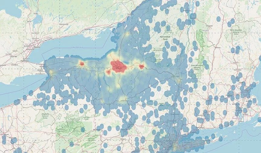
Heat Map
The example of the heat map was shown in the introduction. Very simply, the darker the red, the higher the frequency or percentage. As evidenced in the map below, the highest concentration of respondents is in Onondaga County, NY. There are also some heat pockets in Rochester and Utica. Yellow represents medium frequency or percentage. The blue represents areas of the map with the fewest respondents. Those without colored points have zero respondents or zero data points.
Interactive Map
Unlike the other 3 static maps which were shown included in our reports. This map below may be the most universally liked. It is hosted online through a link and is completely interactive. The user may zoom in or zoom out and hover over specific ZIP Codes to understand the data that lies within. As you scroll over ZIP Codes, pop-up boxes appear with the data. A lot can be done with these maps and it is an interesting and interactive way to share data. Understandably so, clients of our market research firm love these!
Contact Our Market Research Firm
Drive Research is a market research firm located in the U.S. We work with a number of clients in a variety of industries to execute market research projects. Our team assists with setting up objectives, defining a methodology, executing fieldwork, analysis, and reporting.
Questions about an upcoming project? Contact us below.
We analyze more than data—we also track how our site is used to improve your experience. Cookies help us understand what’s working so we can deliver the most relevant insights. Click “Accept” to enable full functionality.
Functional
Always active
The technical storage or access is strictly necessary for the legitimate purpose of enabling the use of a specific service explicitly requested by the subscriber or user, or for the sole purpose of carrying out the transmission of a communication over an electronic communications network.
Preferences
The technical storage or access is necessary for the legitimate purpose of storing preferences that are not requested by the subscriber or user.
Statistics
The technical storage or access that is used exclusively for statistical purposes.The technical storage or access that is used exclusively for anonymous statistical purposes. Without a subpoena, voluntary compliance on the part of your Internet Service Provider, or additional records from a third party, information stored or retrieved for this purpose alone cannot usually be used to identify you.
Marketing
The technical storage or access is required to create user profiles to send advertising, or to track the user on a website or across several websites for similar marketing purposes.